Introduction
As a UX-UI designer with a thirst to grow and to developp my personal skills, I'm always looking for going out of my comfort zone. So when I recieved a UI challenge from a company to design a login | sign up page, I immediately accepted.
The challenge
Design a login | sign up page for desktop. This login page screen must include the following elements:
- A login with at least one social media button.
- Textfields for the "name", "email" and "password".
You're free to add any other element you wish, but make sure it's with good design in mind, relevant for the purpose of the page.
Defining the goal
Since login | sign up forms are the entry point for users, to access a product or a service, their effectiveness hugely relies on design decisions.
So I took a moment to think about the scope of my challenge in order to set the important elements of a successful login page, and came out with the following requirements:
- Make it clear where to login
- Differentiate login from registration
- Allow users to login with external accounts
- Let users see their password (if they want to)
- Warn users before they make a mistake when writing a password
The Approach
The Design process
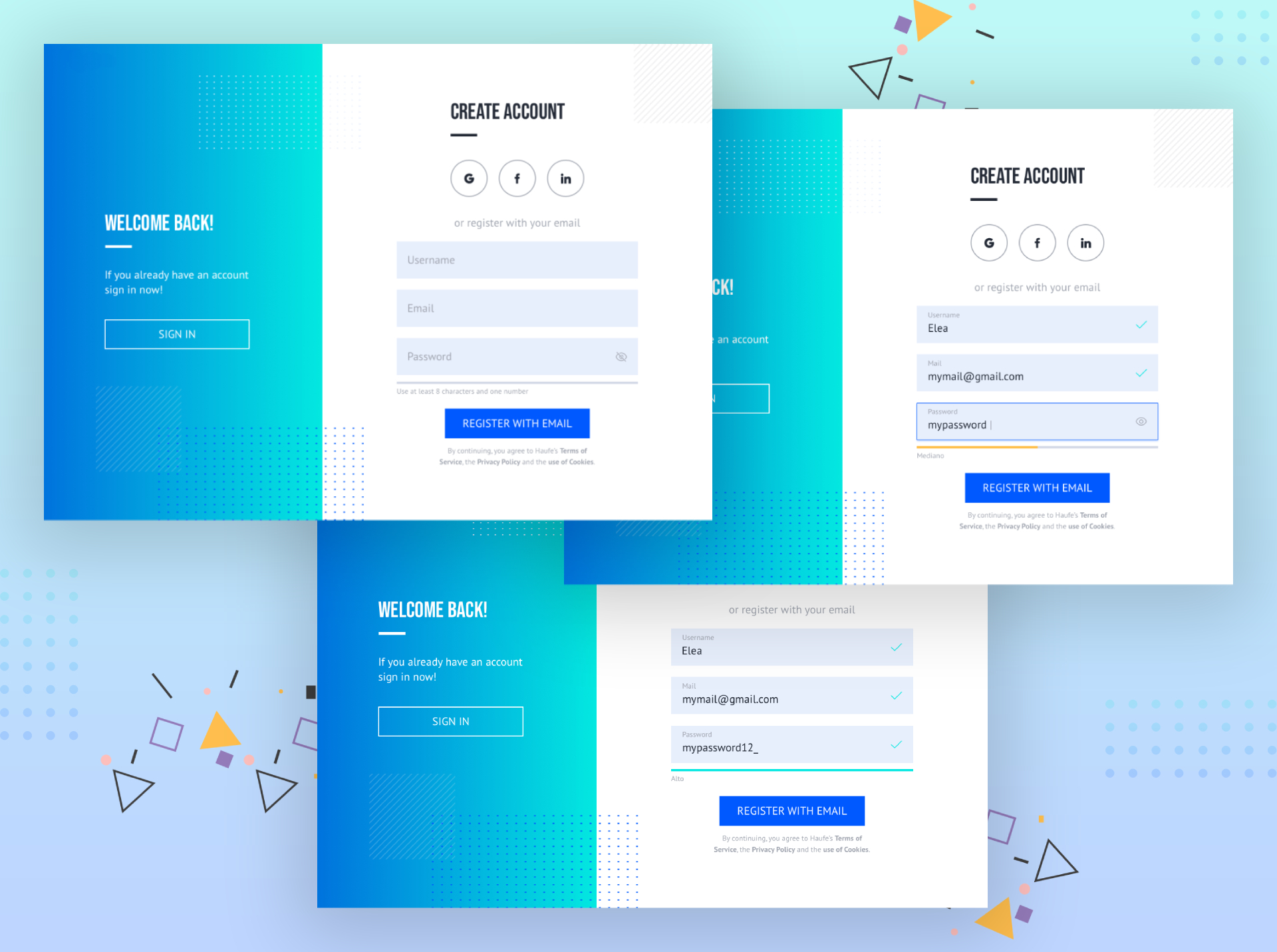
During the design execution, I decided to focus on the login, because it is the part of the process where the users might find more friction, as they need to create an account from scratch.
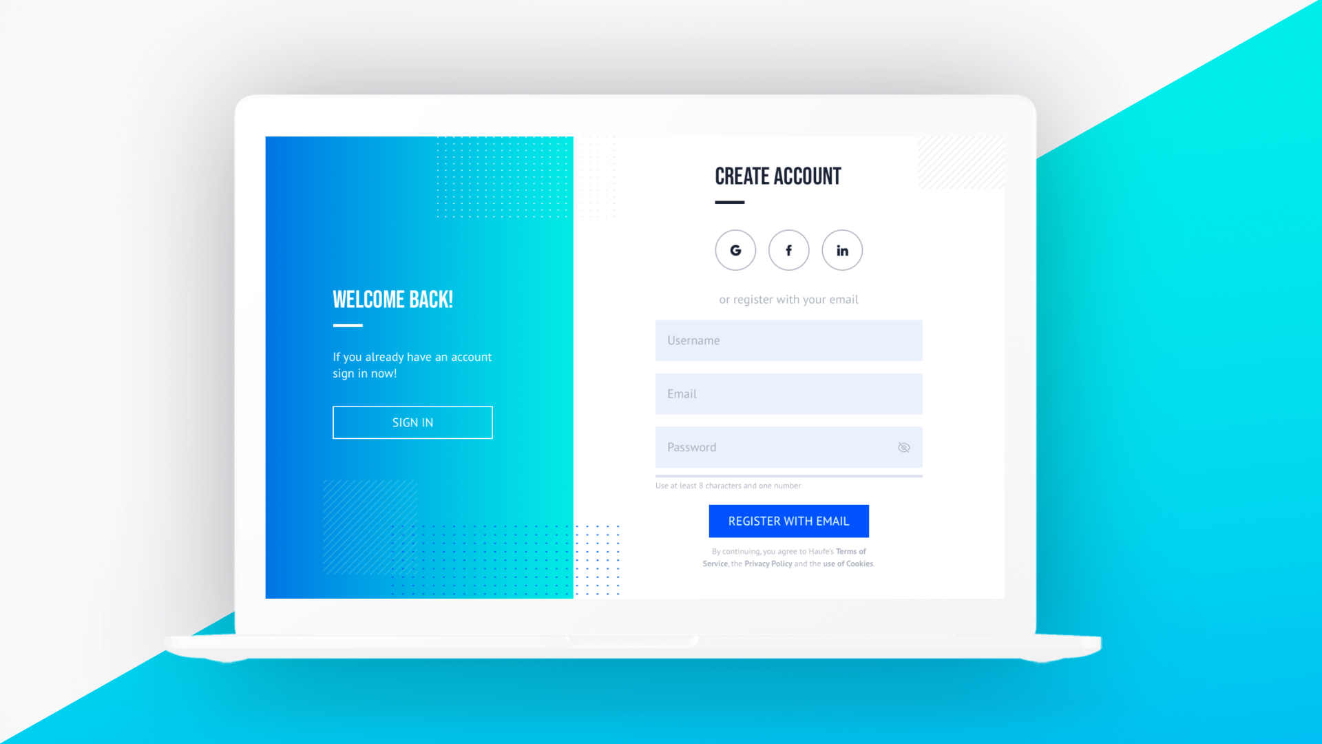
I chose a two column layout, so the users could easily access to their account wether they are new comers or they are already users of the service.
The big gradient rectangle on the left side has double purposes. One of them is that it draws attention to the central form. The other one is that it makes the overall look & feel of the page visually more welcoming and modern.
About the placement of the social buttons, I chose to put them on the top of the form in order to clearly show the users they could login via an external account that they regularly use. This way they won't have to remember another set of login details.
Finally I added some details to improve the overall experience of filling the form, such as an icon in the password textfield, and validation checkmarks. I also designed a validation bar that warns users about the security requirements of their password. Those elements help reducing frsutration by preventing the users from early mistakes and giving them instantaneous feedback.

Takeaways
This challenge was an excellent opportunity to think more deeply about login pages and experiment with different decisions that go into such details as the placement of the social buttons or the kind of interaction to add in the text fields.
